Happy St. Patrick’s Day! It’s one of our favorite days of the year, but maybe we’re a bit partial to all the green! Did you know the Extra Space Storage logo wasn’t always the bright electric green you see today?
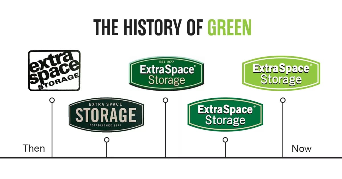
Before we adopted our signature wasabi green, our logo was rooted in a more popular forest green color for 1977—when Extra Space was founded. The original logo was also rectangular in shape, with the company name stacked and tilted 20 degrees. On a freestanding sign, the design looked impressive! It was eye-catching and easy to read. However, when placed on a building, it was hard to tell if it was ever truly level. So, after some time, it was redesigned into the football shape that we still use today.
![]()
In the 70s and 80s, self storage was still a relatively new concept. So, along with the redesigned shape, the word “storage” became the focal point to establish an easily recognizable product and purpose. In later iterations and as the brand became more recognizable, the words “Extra Space” joined center stage, the vintage “EST. 1977” was removed, and the font was updated to modernize the brand.
![]()
In 2013, we set out to modernize our logo and brand once again and updated our signature color to wasabi green—a bright and modern color that sets us apart. We recognize that when customers need storage, they are often going through a transition in life. And whether it’s a happy, sad, or challenging time, our goal has always been to help our customers to a better tomorrow. We wanted our brand and logo to reflect our clean, bright, secure locations and how our team cares for customers when they walk through the door.
“Logos and colors are important pieces that make up a brand—but a brand is so much more,” shared Adam Day, Multi-Media Design Developer at Extra Space. “It’s the collection of emotions and experiences a person has when interacting with any of its pieces. Color is a great tool to emote the emotion of a brand. For example, green is the color of nature. It encourages our brains to think of growth and progress. It has the peace and calm of the color blue, combined with the energy of the color yellow. When customers approach a bright green storage unit door, we hope they have a similar emotional response and think of opportunity and growth, no matter their background or situation.”
So, next time you visit an Extra Space Storage location in your neighborhood, we’ll be there to help you get to your better (and brighter) tomorrow. And at least for St. Patrick’s Day, we hope you’re wearing green! **Pinch**
Want to join our team? Visit our careers page to learn more about company culture and job opportunities.