Evolution of the Green Extra Space Storage Logo
Known today as your trusted storage partner, revisit the history of the Extra Space Storage logo and how our brand identity has evolved through the years.

Ever wonder how Extra Space Storage found its signature shade of green? Or how the logo came to be an oblong shape? Take a trip back in time and see how the logo has changed over the years—and how our brand identity has evolved alongside it.
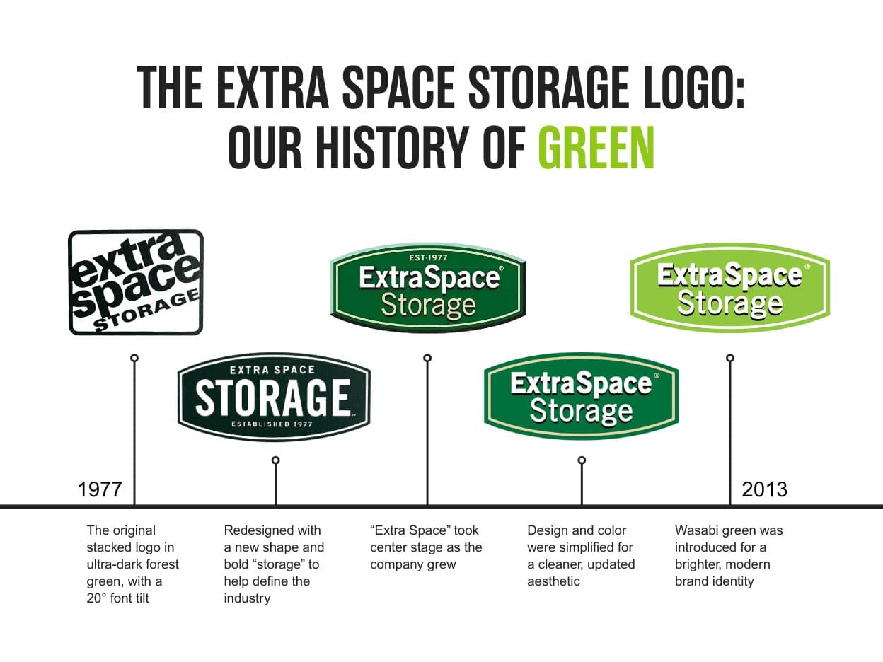
The Origin of Our Self Storage Logo
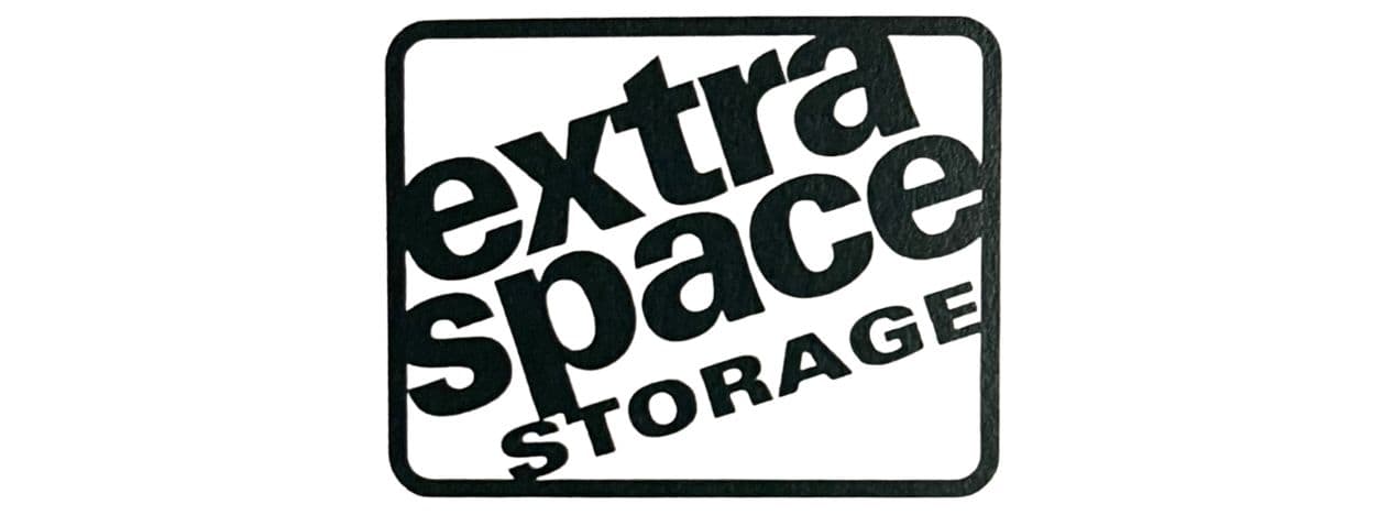
When Extra Space Storage was founded in 1977, the logo was a trendy-for-the-time color gradient of nearly black to dark forest green in bold lettering. This original iteration was rectangular, with the company name stacked and tilted 20°. When placed on a freestanding sign or billboard, this logo design was eye-catching and easy for passersby to read. However, when placed on the side of a building, it was hard to tell if it was level. So, after some time, the logo's shape was redesigned into the recognizable football shape that we still use today.
A Push to Emphasize Storage in Our Logo Design
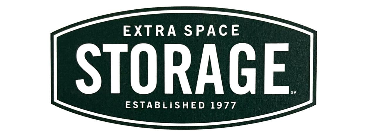
In the '70s and '80s, self storage was still a relatively new concept. So, along with the redesigned shape, the word “storage” became the focal point to establish an easily recognizable product and purpose. This design also removed the color gradient, solidifying the logo's color design into a dark green background with a beige font—which was easier to read and portrayed dependability.
Bringing Extra Space Front & Center with a Brighter Green
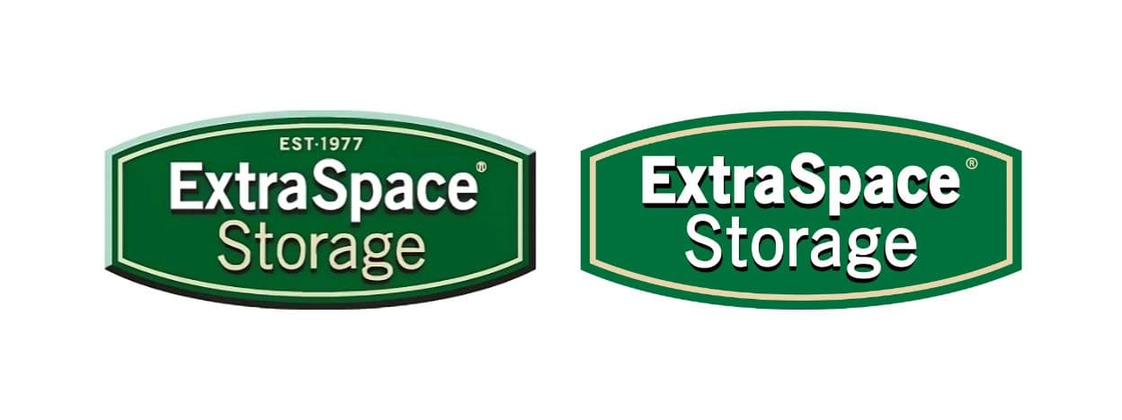
As our brand became more recognizable, the words “Extra Space” joined center stage, and the font was updated to modernize the brand. A shift from the former dark colors, the latest logo design featured a bold evergreen forest color, helping it stand out among contemporary brands like Starbucks, Land Rover, and BP. Forest green represented prosperity and security, portraying the longevity of the EXR brand and self storage as a whole. The color was also a nod to our founding year, as forest green was a popular color in 1977. During these years, the logo design was simplified to eliminate the “Established in 1977” phrasing and remove the bold embossing in favor of a simplified yet easily recognizable look.
Modernizing Our Storage Logo to Align with A Better & Brighter Tomorrow
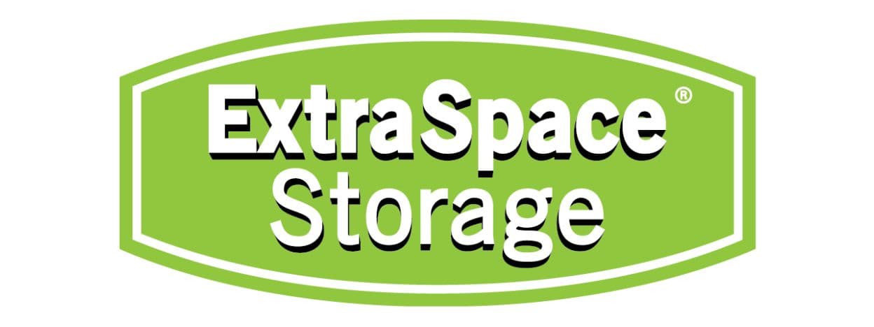
In 2013, we set out to modernize our logo and branding once again and updated our signature color to wasabi green—a bright and modern color that sets us apart. We recognize that when people need storage, they're often going through a transition in life. Whether it’s a happy, sad, or challenging time, our goal has always been to help our customers get to a better tomorrow. We wanted our brand and logo to reflect our clean, bright, secure locations and how our team cares for customers when they walk through the door.
How Color Shapes Our Brand Identity
“Logos and colors are important pieces that make up a brand—but a brand is so much more,” shared Adam Day, Multi-Media Design Manager at Extra Space Storage. “It’s the collection of emotions and experiences a person has when interacting with any of its pieces. Color is a great tool to portray the emotion of a brand. For example, green is the color of nature. It encourages our brains to think of growth and progress. It has the peace and calm of the color blue, combined with the energy of the color yellow. When customers approach a bright green storage unit door, we hope they have a similar emotional response and think of opportunity and growth, no matter their background or situation.”
Inspired by our evolving brand? Visit our careers page to learn more about company culture and job opportunities.